Visual Composition Tips: Rule of Thirds and Beyond
Master visual composition with the rule of thirds, leading lines, negative space, and balance. Practical tips for designers, illustrators, and game artists.
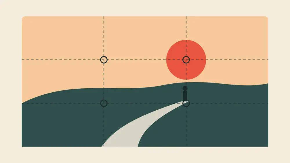
Two designers can use the same colors, the same fonts, and the same illustration, yet one layout feels calm and clear while the other feels messy. The difference is usually composition: where things are placed and how the eye moves between them. These practical tips work for posters, websites, illustrations, thumbnails, and game screens alike.
1. Start with the rule of thirds
Imagine two horizontal and two vertical lines that split your canvas into nine equal parts. The rule of thirds suggests placing key elements along those lines or on the four points where they cross. A subject placed slightly off-center often feels more dynamic than one placed dead center.
Fun fact: the term was first written down by the English painter and engraver John Thomas Smith in 1797, in his book Remarks on Rural Scenery. Today most cameras and editing apps can show a thirds grid. Adobe's guide to the rule of thirds in photography shows many examples.
Quick tip for landscapes
Put the horizon on the top or bottom third line, not in the middle. Choose which part matters more, sky or ground, and give it two thirds of the frame.
2. Choose one clear focal point
Every composition needs a star. Make it the biggest, brightest, or most contrasting element, and let everything else support it. If several elements compete equally, the viewer does not know where to look first. Strong color contrast helps here, and our guide to color contrast rules explains how to measure it.
3. Use leading lines to guide the eye
Roads, rivers, fences, arms, light beams, and even a character's gaze create lines that pull attention. Point those lines toward your focal point. In game art and level screens, paths and lighting can quietly lead players to the next goal, a technique closely tied to teaching players without tutorials.
4. Give your subject room to breathe
Negative space is the empty area around and between objects. It is not wasted space. It makes the subject stand out, improves readability, and gives a design a premium, confident feel. When a layout feels crowded, try removing an element before shrinking everything.
5. Balance visual weight
Large, dark, saturated, or detailed elements feel heavier than small, light, or simple ones. Balance does not have to mean symmetry. A big shape on one side can be balanced by several small shapes or a bright accent on the other side. The Nielsen Norman Group's article on principles of visual design covers scale, hierarchy, balance, contrast, and Gestalt in more depth.
6. Group related elements
According to Gestalt psychology, people see items that are close together or look similar as one group. Use this to organize information: keep a title close to its text, align buttons that belong together, and add space between unrelated sections.
7. Know when to break the rules
Composition rules are starting points, not laws. A perfectly centered subject works well for symmetry, logos, app icons, and moments that should feel still or powerful. Break a rule on purpose, not by accident.
Good composition is invisible. Viewers do not notice the grid; they simply understand the image faster.
A quick composition checklist
Can you name the focal point in one second?
Do the lines in the image lead toward it?
Is there enough empty space around important elements?
Does the layout feel balanced when you squint?
Does it still work as a small thumbnail?
Keep exploring
Composition works best with good type. Read our font pairing tips, then browse the creative projects at Ryuartistry for inspiration.