Font Pairing Tips: Combine Typefaces Like a Pro
Practical font pairing tips: limit your typefaces, pair contrast with harmony, match x-heights, use superfamilies, and set readable line length and spacing.
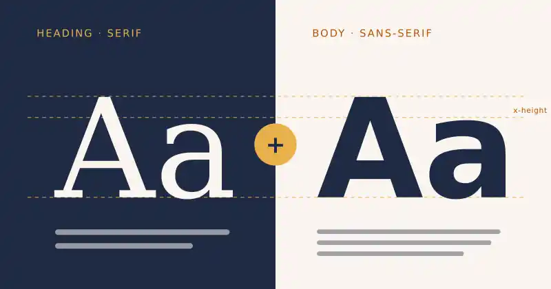
Choosing one good font is easy. Choosing two that work together is where many designs start to look messy. A strong font pairing creates clear hierarchy, sets the mood, and keeps text comfortable to read. These practical tips will help you combine typefaces with confidence, whether you are designing a website, a poster, or a game menu.
1. Limit yourself to two typefaces
Most layouts need only two fonts: one for headings and one for body text. A third, such as a monospace font for code or data, should have a clear job. Every extra typeface adds visual noise, so create variety with size, weight, and color before adding another family.
2. Aim for contrast, not conflict
Fonts that are too similar look like a mistake, while fonts that are too different fight for attention. The classic solution is to pair categories: a serif heading with a sans-serif body, or the other way around. The contrast should be obvious, but the overall feel, whether formal, friendly, or technical, should match.
Pairing ideas to try
Elegant serif + neutral sans-serif: great for editorial and portfolio sites
Geometric sans-serif + humanist sans-serif: modern and clean for apps and products
Display font + quiet body font: expressive headlines for posters and games, with readable paragraphs
3. Match the x-height
The x-height is the height of lowercase letters such as "x" relative to capitals. Fonts with similar x-heights feel balanced when placed side by side, even if their styles differ. Fonts with mismatched x-heights can make one look oddly small at the same point size.
4. Use a superfamily for an easy win
Some type families come with serif, sans-serif, and monospace versions designed to work together. IBM Plex is a well-known example. Because the versions share proportions and details, pairing them is almost foolproof. For more pairing inspiration, Google's Material Design team shared a set of favorite Google Fonts pairings.
5. Give each font a clear role
Decide in advance where each typeface appears and stick to it. Headings, subheadings, body, captions, and buttons should follow a simple type scale. When roles stay consistent, readers learn your layout quickly and find information faster. Google Fonts Knowledge offers free lessons on building hierarchy and choosing type.
6. Set comfortable line length and spacing
Even a perfect pairing fails if the text is hard to read. Matthew Butterick's Practical Typography recommends an average line length of 45 to 90 characters and line spacing of 120 to 145 percent of the font size. For accessibility, make sure your layout still works when users increase spacing, as described in the WCAG text spacing guideline, which tests line height up to 1.5 times the font size.
7. Test with real content
"Lorem ipsum" hides problems. Test your pairing with real headlines, long words, numbers, and both languages if your site is bilingual. Check it on a phone, a laptop, and in dark mode before you commit.
Good typography is invisible. Readers should notice your message, not your fonts.
Keep exploring
Fonts and colors work as a team. Read our guide to color contrast rules every designer should know to keep text legible, and see a different side of visual craft in making clay out of a shader. Discover more creative work on Ryuartistry.