Color Contrast Rules Every Designer Should Know
Learn the WCAG contrast ratios, the 60-30-10 rule, and simple tests that keep your designs readable for everyone, including people with color blindness.
Color is one of the first things people notice in a design, and one of the easiest things to get wrong. A palette can look beautiful on your monitor and still be hard to read on a phone in bright sunlight, or for someone with low vision. The good news: readable color is not just a matter of taste. It follows a few clear numbers.
What contrast ratio actually measures
Contrast ratio compares the relative luminance, or perceived brightness, of two colors, usually text and its background. It runs from 1:1 (two identical colors) to 21:1 (pure black on pure white). The higher the ratio, the easier the text is to read.
The WCAG numbers worth memorizing
The Web Content Accessibility Guidelines (WCAG) published by the W3C are the most widely used standard. These are the targets for level AA, which most organizations aim for.
Body text: 4.5:1
Normal-size text needs a contrast ratio of at least 4.5:1 against its background, as defined in WCAG Success Criterion 1.4.3.
Large text: 3:1
Text that is at least 18 point (about 24 px), or 14 point bold (about 18.5 px), can go down to 3:1, because larger letterforms are easier to recognize.
Icons and UI components: 3:1
Button borders, input fields, focus indicators, and meaningful icons need at least 3:1 against neighboring colors, according to Success Criterion 1.4.11 on non-text contrast.
At the stricter AAA level, the targets rise to 7:1 for body text and 4.5:1 for large text.
Never rely on color alone
Color vision deficiency affects roughly 1 in 12 men and 1 in 200 women, according to Colour Blind Awareness. A red error state that differs from the normal state only by hue may be invisible to many of them. WCAG Success Criterion 1.4.1 asks that color is never the only way information is conveyed. Add an icon, a text label, an underline, or a pattern.
The 60-30-10 rule for balanced palettes
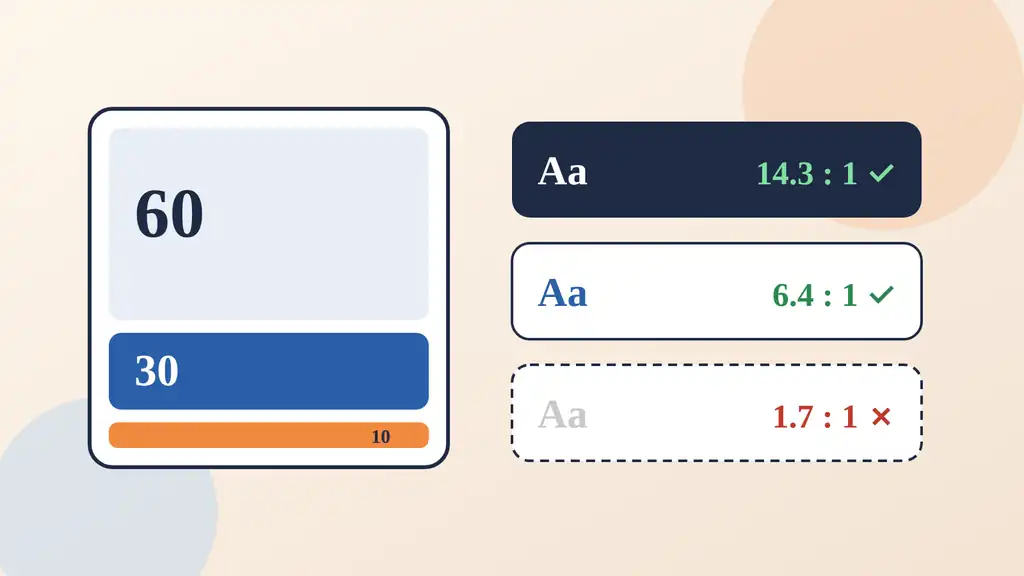
Borrowed from interior design, the 60-30-10 rule is a simple starting point for distributing color:
60% dominant color, usually a calm neutral for backgrounds.
30% secondary color for sections, cards, and navigation.
10% accent color for calls to action and highlights.
It is a guideline, not a law, but it prevents the common mistake of giving every color equal weight. Keep the accent rare so it actually draws attention, and check it against its background like any other text color.
Quick tests you can run today
Check every text and background pair with the WebAIM Contrast Checker.
Use the contrast tool in your browser DevTools. MDN's guide to color contrast explains how the ratios are calculated.
Switch your design to grayscale. If the visual hierarchy disappears, you are leaning on hue instead of lightness.
Look at your screens on a phone outdoors or at low brightness.
Good contrast is invisible when it works. People simply read, click, and move on.
Keep exploring
Contrast is one part of a wider visual craft. If you enjoy the technical side of visuals, read how we made clay out of a shader, or see why speed matters for design in our plain-language guide to Core Web Vitals. You can find more experiments on the Ryuartistry homepage.