Level Design Lessons: Teach Players Without Tutorials
How great games teach without tutorials: lessons from World 1-1, the four-step level structure, safe practice spaces, and visual signposts any designer can use.
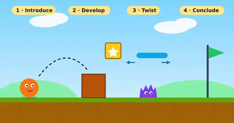
Most players skip text boxes. They want to play, not read. The best games know this and teach through the level itself, so players learn by doing and feel clever along the way. Here are proven level design lessons for teaching mechanics without a single wall of tutorial text.
Fact: one of gaming's most famous levels is a tutorial in disguise
The first stage of Super Mario Bros., known as World 1-1, never tells you how to play. In a 2015 interview, Shigeru Miyamoto walked through how the opening screen was built to teach: the player starts on the left with empty space to the right, the first enemy walks toward you so you learn to avoid or jump on it, and the first power-up is placed so it is hard to miss. Game Developer's write-up of how Miyamoto built World 1-1 is a great summary of these ideas.
1. Introduce one idea at a time
Give each new mechanic its own moment. When a jump, an enemy, and a moving platform all appear together, players cannot tell which one caused their failure. Present a single idea in isolation first, then combine it with others once it is familiar. In user experience design this is called progressive disclosure: show only what people need now, and reveal complexity gradually.
2. Use the four-step structure
Nintendo designer Koichi Hayashida has described a four-step approach to stage design, inspired by kishōtenketsu, a classic East Asian narrative structure. Nintendo Life's coverage of the four-step stage design breaks it down:
Introduce: present the mechanic in a safe setting.
Develop: test it in slightly harder situations.
Twist: change the rules or combine it with something new.
Conclude: end with a final test that shows mastery.
Because each mechanic gets a full arc and then leaves, levels feel fresh instead of repetitive.
3. Build safe practice spaces
The first time a player meets a new challenge, failure should be cheap. Place a gap over solid ground before placing it over a pit. Let players try a wall jump where falling only costs a few seconds. Once they succeed in safety, raise the stakes.
4. Let the world give the instructions
Players read shapes, colors, and light long before they read words. A ledge that looks grabbable, a cracked wall that looks breakable, or a bright coin trail pointing upward all communicate without text. Designers call these cues signifiers, closely tied to the idea of affordance: the actions an object appears to allow.
Quick signposting checklist
Use one consistent color for interactive objects
Guide the eye with light, collectibles, or camera framing
Keep dangerous things visually distinct from safe ones
Avoid decorations that look interactive but are not
5. Test whether the level really teaches
You cannot judge your own level design, because you already know the answer. Watch new players without helping them. If several people get stuck at the same spot, the level is not teaching clearly enough. For a broader look at the craft, the overview of level design on Wikipedia is a useful starting point.
The best tutorial is the one players never notice. They simply feel smart.
Keep exploring
To check whether your levels teach well, read our playtesting tips for honest feedback. Pair clear levels with responsive controls using our guide to game feel, and follow our own process in the Mochi Island devlog. Find more on Ryuartistry.