Gestalt Principles: How People Group What They See
Proximity, similarity, closure, and common region explained with practical tips to make layouts, interfaces, and posters clearer without extra lines or labels.
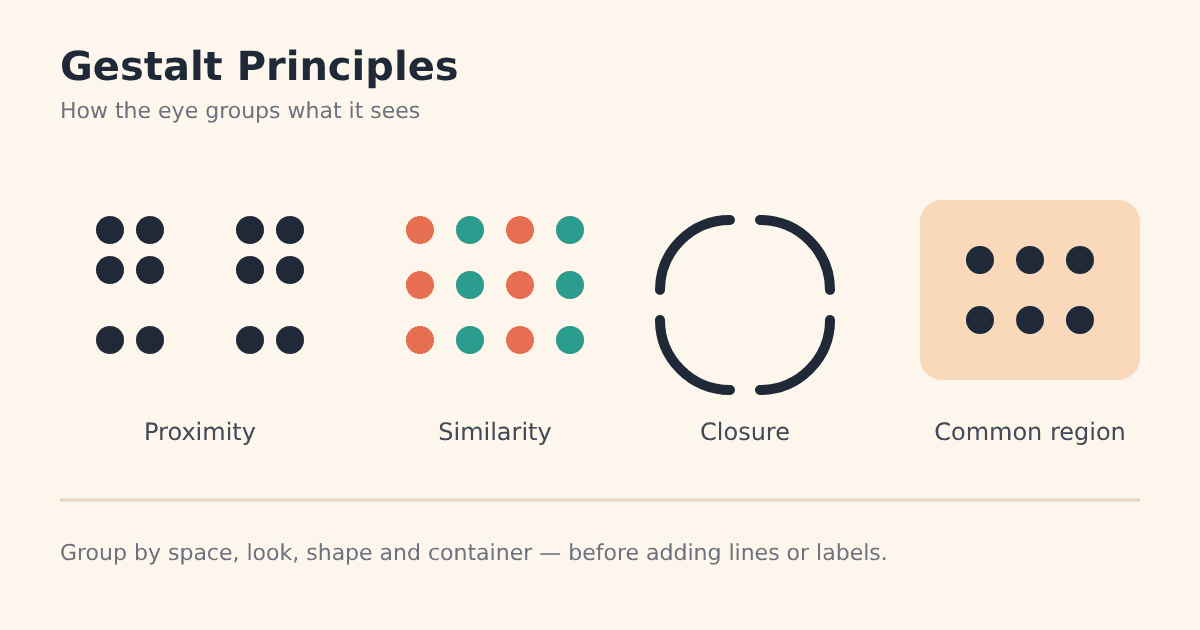
Look at a page for one second and your brain has already sorted it into groups: this is the menu, these are the cards, that button belongs to this form. You did not read anything yet. That instant sorting follows patterns described by Gestalt principles, and designers who understand them can make layouts clearer with fewer lines, boxes, and labels.
Where Gestalt comes from
Gestalt psychology began in Germany in the early 20th century with researchers such as Max Wertheimer, Wolfgang Köhler, and Kurt Koffka. "Gestalt" roughly means "form" or "whole". Their key idea was that we perceive organized wholes first, not a pile of separate parts.
Today these ideas are a core part of visual and interface design. Here are the principles you will use most.
1. Proximity: closeness creates groups
Elements placed near each other look related. It is one of the strongest grouping cues, often stronger than color or shape, as the Nielsen Norman Group explains in its article on proximity.
Tip: keep the space inside a group smaller than the space between groups. A form label should sit closer to its own input than to the field above it.
2. Similarity: same look, same role
Items that share color, shape, size, or style are seen as one family. See NN/g's guide to the similarity principle for interface examples.
Tip: give every clickable link the same treatment, and never style plain text like a link. Consistency teaches users what things do. A limited palette, like the one in our 60-30-10 color rule, makes similarity easier to control.
3. Closure: the mind fills the gaps
We tend to see complete shapes even when parts are missing. A circle drawn with four broken arcs still reads as a circle.
Tip: closure lets logos and icons stay simple. You can remove details and let negative space do the work, as long as the overall shape remains recognizable.
4. Common region: a shared container
Elements inside the same boundary, such as a card, panel, or background block, are seen as a group, even when they are not very close. NN/g describes this in its article on the common region principle.
Tip: use cards for content that must be understood as one unit, like a product with its price and button. Avoid nesting boxes inside boxes; too many borders add noise.
5. Figure-ground and continuity
Figure-ground
We separate what is in front (the figure) from what is behind (the ground). Figure-ground perception is why a dimmed overlay makes a pop-up dialog stand out. Strong color contrast keeps the figure clear.
Continuity
The eye follows lines and curves. Items aligned along a path, like a row of cards or a timeline, feel connected and guide the reader in a direction.
Putting it into practice
Start with spacing. Before adding dividers or boxes, try grouping by whitespace alone.
Do the squint test. Blur your eyes and look at the layout. The groups you see should match the groups you intended.
Do not let principles fight. If two items are close together but styled differently, users get mixed signals. Make proximity and similarity agree.
Combine with composition. Gestalt decides what belongs together; composition decides where the eye goes first. Our rule of thirds guide covers that second half.
For a broader overview, the Interaction Design Foundation's Gestalt principles topic and Laws of UX are good references.
Good layouts are not built from more decoration. They are built from clear relationships.
Keep exploring
Gestalt principles work for posters, slides, game menus, and websites alike. Pair them with smart font pairing, or see how we apply them in projects at Ryuartistry.