White Space in Design: Why Empty Space Matters
Discover why white space makes designs clearer and more readable, the difference between micro and macro space, and practical spacing tips you can use today.
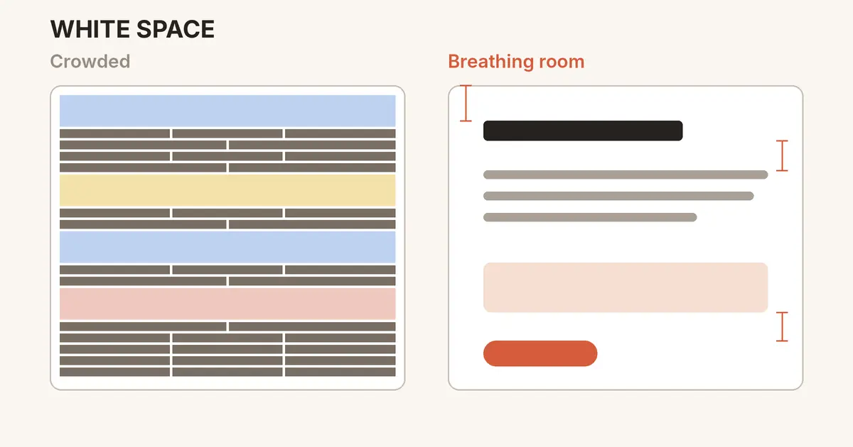
Many beginner designs share one problem: everything is squeezed together. Text touches images, buttons crowd headings, and the eye has nowhere to rest. The fix usually is not adding something new. It is adding white space, the empty area between and around elements.
What is white space?
White space, also called negative space, is any part of a layout that is left empty. Despite the name, it does not have to be white. A dark background, a soft color, or a photo area without detail can all act as white space.
Think of it as the silence between musical notes. Without the pauses, you only hear noise.
Why empty space is not wasted space
It groups related things
People see items that sit close together as belonging together. This is the law of proximity, one of the principles we cover in our article on Gestalt principles. More space between groups and less space inside them makes structure obvious without extra lines or boxes.
It creates focus and hierarchy
An element surrounded by space draws attention. That is why premium brands often show a single product on a calm background. The Nielsen Norman Group explains how spacing works alongside size and color in its guide to visual hierarchy.
It makes text easier to read
Comfortable spacing between lines and paragraphs helps readers keep their place. It also matters for accessibility: the WCAG text spacing criterion requires that content still works when users increase line height to 1.5 times the font size and paragraph spacing to 2 times.
Micro vs macro white space
Micro white space is the small space inside elements: between letters, lines, list items, and the padding inside a button.
Macro white space is the large space between major sections: margins around the page, gaps between a hero section and the content below, and space around images.
Good designs balance both. Generous macro space with cramped text still feels uncomfortable, and the reverse feels scattered.
Practical tips you can use today
Use a spacing scale. Pick a set of values based on a small unit, such as 4, 8, 16, 24, 32, and 48 pixels, and use only those. Material Design's spacing guidelines are built on a 4dp grid for the same reason: consistency.
Make outer space bigger than inner space. The gap between two cards should be larger than the padding inside each card, so each card reads as one unit.
Set line height around 1.4 to 1.6 for body text. Headings can be tighter because they are short and large.
Keep lines at a readable length. Around 45 to 75 characters per line is a long-standing typography guideline. Very wide paragraphs tire the eyes.
Remove before you add. If a layout feels busy, delete a decoration, a divider, or a redundant label before shrinking anything.
Respect safe areas on mobile. Apple's Human Interface Guidelines on layout recommend keeping content clear of screen edges and system UI.
White space is not the absence of design. It is the part of the design that lets everything else breathe.
A quick self-check
Squint at your design until the details blur. Can you still see clear groups and one obvious focal point? If everything melts into a single gray block, add space between sections first, then adjust the details.
Keep exploring
White space works best together with color and type. Learn to balance colors with the 60-30-10 rule, pair typefaces with our font pairing tips, or see the creative work we make at Ryuartistry.